Friday, September 26, 2014

Red Riding Hood


I've had this piece done since early September, but I wanted to hold on uploading it until now. This piece was submitted for the Blick Art Show. The theme was "Good Enough to Eat". So I'm thinking to myself 'what's a good way to create a piece for this theme without drawing various food?' Little Red Riding Hood came into mind and I'm thinking why not make this a 'double whammy' piece. As you can see Red is too occupied on a delicious strawberry to notice the hungry wold right behind her.

Unfortunately I didn't place, but still I am proud of this piece. It is nice illustrating something from a classic story. Plus, I'm a total sucker for cloaks.

I have managed to take a couple in progress shots to show how it evolved.

 I first started working on Little Red. I wanted her cloak to be a nice rich color.


I laid down a soft yellow-red base color for the wolf. Though this color won't exactly show through, I just needed a color to work off of to help add more variety.


Started on the background. I purposely left the trees and cottage inkless to give them the illusion of being in the distance. 


Picture is primarily done at this point. The tape is to keep the borders clean and crisp.

 
Close ups:


There you have it! I personally had a lot of fun with this one.

Good Enough to Eat
Copic Markers on Smooth Bristol
9 in x 12in

What childhood stories do you like?

Friday, September 12, 2014

Ovarian Cancer Awareness


September is Ovarian Cancer Awareness month. Though if you ask me, every month should be awareness month. Ovarian cancer is known as the 'Silent Killer'. Unfortunately early detection is extremely difficult. It is the persistent, smallest symptoms that women of all ages should look out for.
 
Potential symptoms include:
 
-Bloating
-Pelvic or abdominal pain
-Trouble eating or feeling full quickly
-Feeling the need to urinate urgently or often 

Other symptoms that can occur:
 
-Fatigue
-Upset stomach or heartburn
-Back pain
-Pain during sex
-Constipation or menstrual changes

Please be aware that all females (yes, even children) can get this. So please, spread the word. Share this post. Tell your wife, mother, daughter, niece, friend (heck, even grandma!) about this cancer. Early detection is the key! Education will help save lives. Let this awareness become as popular as the awareness for breast cancer.
 
About this piece:
 
I've wanted to do a little something for the awareness this month. After much thought, I give you the little umbrella girl. With her head held high and looking only forward, this brave girl walks on teal grass barefoot that supports her while her umbrella symbolizes the support and protection from getting beaten upon by the cancer. The sunrise that fills her represents hope.
 
Title: There is Always Hope
Medium: Derwent Inktense colored pencils
Paper: 9x12 Canson Cold Press watercolor
 
Websites about Ovarian Cancer:

So please, spread the word.

(This is dedicated to you, Melanie Chasen) <3

Saturday, September 6, 2014

Unique Sunrise


I was at my grandma's house the other week and was struck with a simple creative idea. After messing around a bit, this came into being. It's nothing fancy at all, but the sun is full of hot fire, plasma, and other goodies that I just thought it'd be cool representing that to an abstract degree.

Besides, perhaps if we were to look past the pure brightness of the sun, it'd be cool if we could witness something like this.

Title: Sunrise
Medium: FC Polychromos
Paper: 6x9 on Strathmore black Artagain

Tuesday, August 5, 2014

Of Unicorns and Lilies


 Today's post is dedicated to all things pure and hopeful. I've been imagining a unicorn walking through a forest full of Canada lilies, so I thought I should put that to paper. And also that I've been meaning to put a nice header on my blog and thought this piece would be great for it.

This artwork is also my first time using odorless mineral spirits (OMS) with colored pencils. 


 My goal was to keep the background blurry, but still give the feeling that the unicorn was walking through a forest.


 Here, you'll notice that the right side is a bit more darker than the left. That is the OMS at work. I used a paint brush to paint over the work I've done. It does a pretty good job removing the 'scratchy' look of colored pencils. It makes a pretty good blender.


Background is done and I've started working on the shadows and cast shadows of the unicorn.

I added a very light green (Earh Green) on the unicorn in random patterns to represent the shadows of the leaves of trees high above.

Here is the finished piece!

A close up.

Title: Keeper of the Forest
Medium: Faber-Castell Polychromos colored pencils
Size: on 9x12 Strathmore Drawing paper


Monday, June 30, 2014

The Mighty Sphinx


The Sphinx was powerful and wise creature of mythology. Unlike it's Greek cousin, which would eat travelers who would incorrectly answer its riddle, the Egyptian Sphinx was often portrayed as a guardian of the tomb of the pharaohs. It was less malevolent, though equally as dangerous. 

The Great Sphinx of Giza often comes to mind when people hear the word 'sphinx'. 

This is just a simple picture I made. I wanted to make a stylized version of an Egyptian Sphinx. The wings are not really common with the ones in Egypt, they're rather Greek, but it felt a little naked in the back area. Perhaps this one got tired of riddles?

Title: Egyptian Sphinx
Paper: 5"x7" Stonehenge
Medium: Faber Castell Polychromos

Monday, June 16, 2014

Mermaid Lake


Salutations. I've been working on this piece for a bit. To be honest, I had the line art for this in my sketchbook for a little over a year, and I decided I should do something with it. Better late than never, right? I've decided I wanted to try a new approach with markers. If you noticed, there are no inked lines in this drawing. My goal was to try to achieve a painterly-like affect with this piece (or at least get defining edges on certain parts of it without the use of line art). I think I did a pretty good job, for the most part. 

I'm still camera-less, but I did make sure to take a few pictures along the way on my phone. I've always like seeing progress shots of other peoples artworks. It's so interesting to see how things started out before it reached the finished look. I hope you guys have enjoyed seeing those of mine too throughout this blog.

This is the prep stage. The drafting tape is used to keep the border clean and crisp. I've traced the line work very lightly on nicer paper.


Once the tree is all colored in I started work on the grass. My goal throughout this piece is to try to give it and autumn(y) look. That's why you see a light orange color under the green(the color is YR01 Peach Puff to be precise). I've used that as a base color a lot through this piece, to try to keep colors uniform. 
 
 Grass is done. The grass by itself took a little over an hour to complete. Since this is the foreground, I wanted it to have more details.


The trees in the background are complete. I am kinda fond of that evergreen there. I started blocking in the shadow parts of the mermaid.

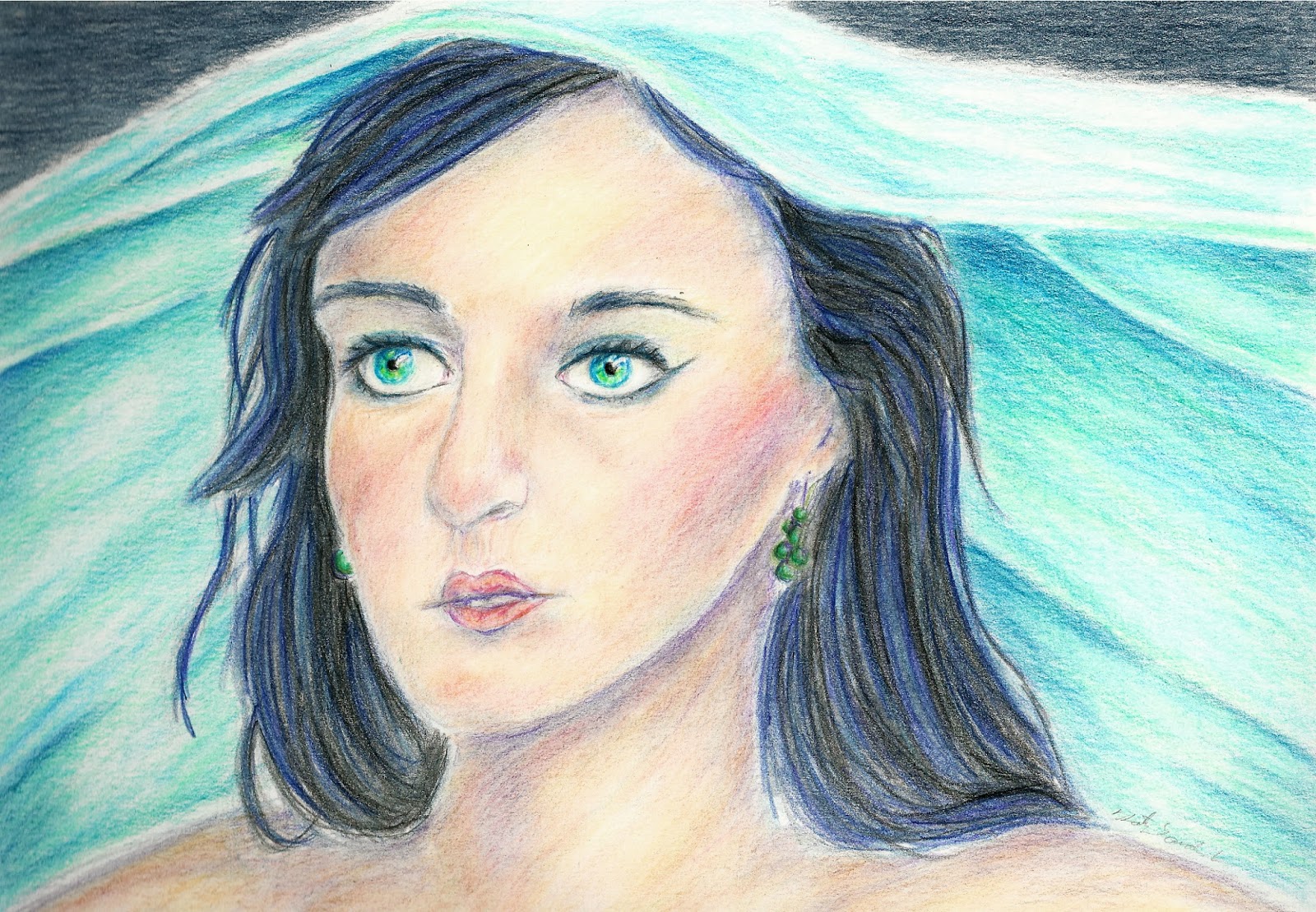
I started work on the mermaid. I didn't want her tail to be the same green as the rest of picture (it would have blended in too much), so I made it a soft teal. Once again I put a base coat of the YR01 under the teal, so that way she is not standing out obnoxiously. 

The water was the last thing to add. I was procrastinating with the water. I wanted to see how everything looked with the background before creating the lake. I haven't done a lot of water pictures so I was a bit worried how it might turn out. Overall, I'm pretty happy.

I added the finishing details with colored pencils. Now the mermaid has eyes and doesn't look creepy! Yay!

Overall,  am extremely happy how this turned out. I just wished the picture and scan came out better. It's more rich then what it shows on the screen.

Well, the next thing on my schedule (Schedule? What schedule?) should be a simple sphinx that I'm working on. It should be up within a few days. Till then, keep an eye out. 

Title: Mermaid Lake
Paper: 9x12 Strathmore Smooth Bristol
Medium(s): Copic marker, Faber Castell Polychromos colored pencils

Friday, May 9, 2014

Derwent Inktense

Hello all! In late April I went to the art store to have a look around. I came across a 24 set of Derwent Inktense pencils. I had a 40% coupon on me, so I thought "why not?" I've been itching to try them for the past couple years, and I'm happy to say they are worth the excitement. The Inktense come in a total of 72 colors that can either be bought individually or in sets. The colors in the 24 set do have
a nice variety of color to create different types of pictures. The great thing about limitation is that it really works on your creativity.

The Inktense works very similar to watercolor pencils, they're water soluble. The big difference is that when wet, they turn into ink! Unlike normal watercolors/watercolor pencils, once completely dry, water cannot reactivate it. You cannot rework the colors, but you can add multiple layers over the dry ones and make the picture more rich in color and make certain aspects pop more.

These pencils can either be used wet or dry. Dry, they tend to have a deep richness to them and become translucent when wet. They do dry fast though, so it can be tricky trying to avoid those "blooms"(You can sort of see it in my iris blue on my color chart. I added a bit too much water...oops). An aqua brush(paint brush you can fill with water) works really well with these. They can be wetted on paper, or if you want to use a more painterly approach you can take a brush and wipe it on the lead of the pencil to collect the pigment. Whatever works for you.

Overall, I really love these. I love the way the respond to water (more so than my watercolor pencil set I owe). Perhaps with time I by their other colors separately. I brought them over to my friend's house and we were both messing around with them, having a blast.

Here are a couple paintings I created with them;

                            Sunset:
  
              Peaceful Valley: 

'Sunset' on 3.5 in x 5 in Strathmore Visual Journal watercolor paper
'Peaceful Valley' on 9x12 in Canson XL watercolor paper

Whether you're a hobbyist, serious, just like messing around, give them a shot.

Monday, April 14, 2014

Experimenting Fun


 Of all the art I created using markers I never really attempted realism. So I push myself to create this lovely test piece. I mainly wanted to improve upon my eye drawing ability to further try to make them realistic. Along the way I decide to experiment with coloring skin. Overall, I am very happy with the result. Coloring with markers is trickier than using colored pencils due to the fact I'm working with ink. Whatever mistakes I do make require more finesse to fix, if possible.

Unfortunately, I wasn't able to take a lot of process shots of this piece. The digital camera has officially crapped out and died. I've taken some pictures on my phone, but I prefer camera quality over iphone. Looks like I have some money to save.


I set down some blue-violet to mark where the darkest shadows are going to be.


Some pictures of the skin being worked on. I mostly went from light to dark without blending first. Once I was pleased about the color placement I then went back to blend everything to help smooth it out.

Title: The Eyes Have It
Medium: Copic markers, white gel pen, Copic opaque white
Paper: 9x12 Strathmore Smooth Bristol


Monday, March 10, 2014

Veiled


I was looking through some photos on my computer and camera, and I realized I had taken process shots of a picture I worked on last year. I had almost forgotten about them. I really do like the pictures I have taken so I though I would share the step by step process I did for this piece. This is by all means no tutorial, but to show what I did to get to the finish product.


After I lightly sketched out the picture I colored over the lines with a dark blue and started defining the shadow areas on her face

I then used the blue to define what will be the darkest parts on her hair.

I began the base color of her skin, using blues and purples for shadows.

Adding more color to her skin. Using pinks, violets, and even a little bit of green too.

Eyes and lips are finished, and I began working on the hair.

Hair is mostly finished.

The veil is done.

I darken the hair more to help give it volume, and darkened some spots on the veil to help make it pop more.

Worked on the background, and smoothed the skin out with a blending stump and it's done!

This picture was fun to do. This was my first piece using purely Faber Castell Polychromos. This is also the first colored pencil drawing I did on Strathmore Smooth Britol. Even though I really like how smooth the skin came out, I was unable to go as dark as I would have like to do to the paper not really having a tooth. It was a fun experiment though.

This piece was done for the Colored Pencil Magazine monthly challenged last year. The monthly challenges are free and open to all! It's a great way for honing your skill, and the people there are super nice. Please check it out. :)

Title: Veiled
Medium: FC Polychromos Colored Pencils
Paper: 9x12 Strathmore Smooth Bristol


Monday, February 24, 2014

Carousel Horse


I've always had a soft spot and a love for carousels. I love how whimsical and elegant the horses look in all their different poses and designs. Unfortunately, it's hard finding a carousel with really gorgeous horses. Most of the time in carnivals, the horses are cookie cutters and twins.

This is just a little tribute for carousels. I wanted to make a white horse with a caramel colored mane. For the design, I took some inspiration with the tack and gear people would have for their horses during the Middle Age(and most likely Renaissance too). Though the design may be simple, I tried to make it elegant.

Here are some progress shots I took. I wanted to take a couple more throughout the process, but the camera was crapping out on me. One day I'll save enough money to buy a better and lighter weight digital camera for myself.


Medium: Colored Pencils
Paper: Strathmore Artagain Black 6x9