Showing posts with label copic. Show all posts

Monday, May 29, 2017

Frog Stew

 Hello all! It's been forever and a day since I last posted something, I know. I've been trying to figure out a way to balance my full time job and time managing my art (I'm still working some things out). Anyway, while Halloween isn't for a few months it doesn't mean witches get to rest for a whole year. This is a late Mother's Day present for my mom who absolutely loves all things witchy (and frogs). Better late than never. It's been a long while since I used my copics, so I decided to use those as my medium of choice.

First off, to start this piece I actually tried a couple new products. I love the natural feel of dip pens when inking. Personally, I feel have better control with them verses the usual technical pens. While I have dabble with dip pens for little things in the past, this is the first time I've used them for a finished art piece. I had to make sure I got the right ink though. This particular ink I used is Kaimei Drawing Pen Ink. This ink handles alcohol based markers with breeze. No bleeding issue. However it will NOT work with watercolors, so a separate ink is necessary for that work. For the dip pen I used the G Model nib for the variety of line widths I could make. For the super fine lines I used a quill nib.

 After I had the foreground ink I used a lavender color for the base color for the background. My goal was to make a dark muted background as I wanted the focus on the witch.


The at this point the wall was mostly finished (saved for the window and the broom). I tried making the area around the sconces lighter to show the area of light from the candles.

 Floor and trim is mostly done. The color on the floor is the same used on the wall minus the lavender shade. I'm trying to keep everything unified.

 Started working on the witch. I made her a redhead because I like coloring redheads. It's such a pretty hair color.
 It's almost finished at this point. Just coloring the little details. I saved the window for last because I wanted to see how the overall picture was going to look.

So there you have it. I also added some warm gray in her hair too to help tone down the vibrant color and to harmonize more with the rest of the piece. Overall I am happy how it turned out. More importantly my Mom really likes it. Mission accomplished.

Title: Frog Stew
Copic marker on smooth bristol


Friday, September 26, 2014

Red Riding Hood


I've had this piece done since early September, but I wanted to hold on uploading it until now. This piece was submitted for the Blick Art Show. The theme was "Good Enough to Eat". So I'm thinking to myself 'what's a good way to create a piece for this theme without drawing various food?' Little Red Riding Hood came into mind and I'm thinking why not make this a 'double whammy' piece. As you can see Red is too occupied on a delicious strawberry to notice the hungry wold right behind her.

Unfortunately I didn't place, but still I am proud of this piece. It is nice illustrating something from a classic story. Plus, I'm a total sucker for cloaks.

I have managed to take a couple in progress shots to show how it evolved.

 I first started working on Little Red. I wanted her cloak to be a nice rich color.


I laid down a soft yellow-red base color for the wolf. Though this color won't exactly show through, I just needed a color to work off of to help add more variety.


Started on the background. I purposely left the trees and cottage inkless to give them the illusion of being in the distance. 


Picture is primarily done at this point. The tape is to keep the borders clean and crisp.

 
Close ups:


There you have it! I personally had a lot of fun with this one.

Good Enough to Eat
Copic Markers on Smooth Bristol
9 in x 12in

What childhood stories do you like?

Monday, June 16, 2014

Mermaid Lake


Salutations. I've been working on this piece for a bit. To be honest, I had the line art for this in my sketchbook for a little over a year, and I decided I should do something with it. Better late than never, right? I've decided I wanted to try a new approach with markers. If you noticed, there are no inked lines in this drawing. My goal was to try to achieve a painterly-like affect with this piece (or at least get defining edges on certain parts of it without the use of line art). I think I did a pretty good job, for the most part. 

I'm still camera-less, but I did make sure to take a few pictures along the way on my phone. I've always like seeing progress shots of other peoples artworks. It's so interesting to see how things started out before it reached the finished look. I hope you guys have enjoyed seeing those of mine too throughout this blog.

This is the prep stage. The drafting tape is used to keep the border clean and crisp. I've traced the line work very lightly on nicer paper.


Once the tree is all colored in I started work on the grass. My goal throughout this piece is to try to give it and autumn(y) look. That's why you see a light orange color under the green(the color is YR01 Peach Puff to be precise). I've used that as a base color a lot through this piece, to try to keep colors uniform. 
 
 Grass is done. The grass by itself took a little over an hour to complete. Since this is the foreground, I wanted it to have more details.


The trees in the background are complete. I am kinda fond of that evergreen there. I started blocking in the shadow parts of the mermaid.

I started work on the mermaid. I didn't want her tail to be the same green as the rest of picture (it would have blended in too much), so I made it a soft teal. Once again I put a base coat of the YR01 under the teal, so that way she is not standing out obnoxiously. 

The water was the last thing to add. I was procrastinating with the water. I wanted to see how everything looked with the background before creating the lake. I haven't done a lot of water pictures so I was a bit worried how it might turn out. Overall, I'm pretty happy.

I added the finishing details with colored pencils. Now the mermaid has eyes and doesn't look creepy! Yay!

Overall,  am extremely happy how this turned out. I just wished the picture and scan came out better. It's more rich then what it shows on the screen.

Well, the next thing on my schedule (Schedule? What schedule?) should be a simple sphinx that I'm working on. It should be up within a few days. Till then, keep an eye out. 

Title: Mermaid Lake
Paper: 9x12 Strathmore Smooth Bristol
Medium(s): Copic marker, Faber Castell Polychromos colored pencils

Monday, April 14, 2014

Experimenting Fun


 Of all the art I created using markers I never really attempted realism. So I push myself to create this lovely test piece. I mainly wanted to improve upon my eye drawing ability to further try to make them realistic. Along the way I decide to experiment with coloring skin. Overall, I am very happy with the result. Coloring with markers is trickier than using colored pencils due to the fact I'm working with ink. Whatever mistakes I do make require more finesse to fix, if possible.

Unfortunately, I wasn't able to take a lot of process shots of this piece. The digital camera has officially crapped out and died. I've taken some pictures on my phone, but I prefer camera quality over iphone. Looks like I have some money to save.


I set down some blue-violet to mark where the darkest shadows are going to be.


Some pictures of the skin being worked on. I mostly went from light to dark without blending first. Once I was pleased about the color placement I then went back to blend everything to help smooth it out.

Title: The Eyes Have It
Medium: Copic markers, white gel pen, Copic opaque white
Paper: 9x12 Strathmore Smooth Bristol


Monday, January 27, 2014

Rapunzel


So this weekend I was working on my Rapunzel picture. I must say I am really proud of this one. The layout may be simple, but I love the way I colored her. I really am improving my marker skills. Originally I was planning on printing out the picture of the sun and trace it, but I decided against it for I felt it wouldn't look as natural. I never drew the Tangled sun symbol before, and I think it turned out nice. She is also inked in purple pen.

Just like my Elsa picture, I'll give a list of colors I used.

Skin: E51, E00, E21, BV31
Bodice: V01, BV00, BV11
Skirt: V05, V15, V17
Ties and lace: RV11, RV93, RV95, RV42
Sleeves: R00, RV11, RV34
Hair: Y15, Y19, YR23
Eyes: G43, YG63, C9
Pascal: YG45
Background: Y08, V09, V17, RV91

Title: Rapunzel
Paper: 9x12 Strathmore Smooth Bristol
Medium: Copic markers

And just to compare, here are a couple pictures I did of Rapunzel a couple years ago.


Wednesday, January 22, 2014

Queen Elsa


Hello everyone. I hope your 2014 has started off good. Since I created my one picture of Elsa, I wanted to make another picture of Elsa in her coronation dress (which is my favorite dress that she's in). I just love the color the dress has, and I especially love the cape in which the warm colors really enhance the cooler ones on her dress. 

The only part that was a bit challenging was her hair. Elsa is a platinum blonde, and wanted to make sure her hair wasn't very yellow. So I added some bits of gray in there to help tone it down.

List of Colors:
-Hair: Y000, Y11, Y32, W2 Prismacolor French gray
-Dress: T4, T5, T8- BG72, BG75, BG78-YR23, YR15, Y19, Y28
-Cape: RV19, V06, RV66- V95
-Skin: E50, E000, E51
-Glove: BG13, BG15

Title: Queen Elsa
Paper: 9x12 Strathmore Smooth Bristol
Medium: Copic markers with a little colored pencil for minor details, and white gel pen

Up Next: Rapunzel!

Saturday, October 19, 2013

Alice in Wonderland

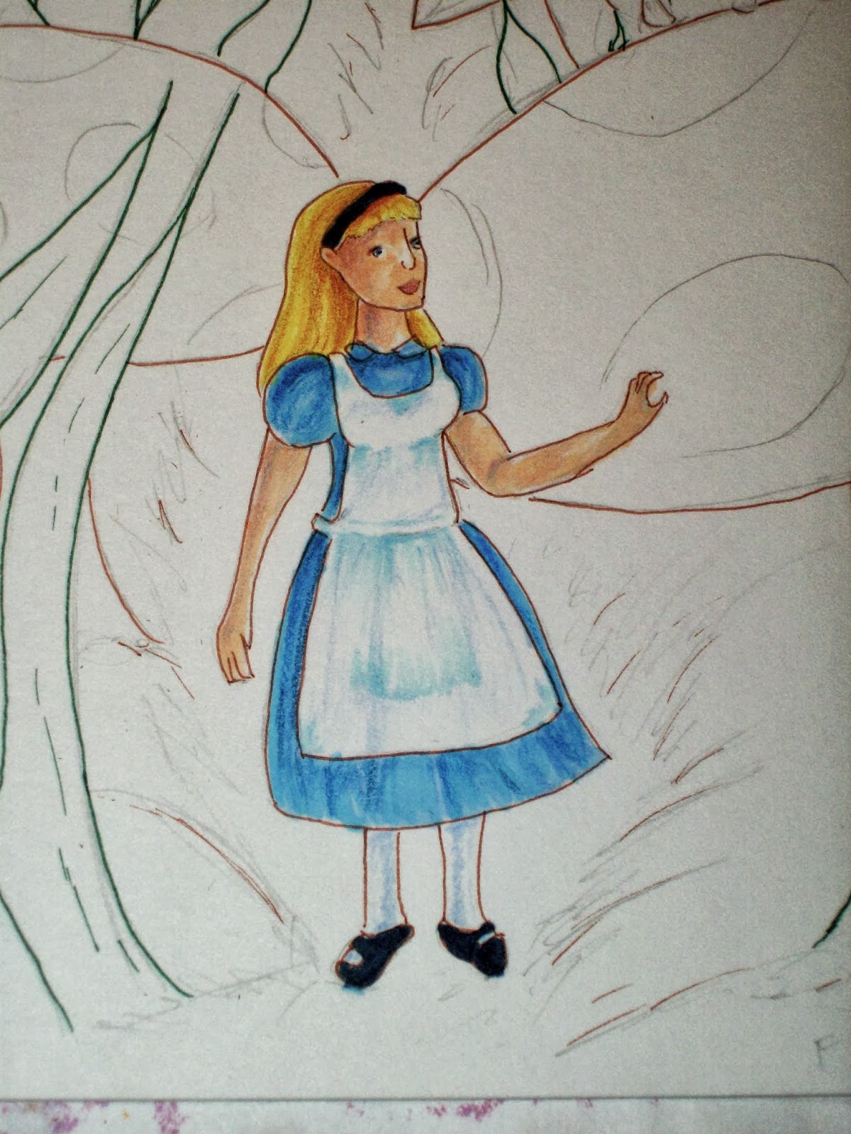
This week I went down the rabbit hole to visit some friends. I was looking through my sketchbook and found a picture of Alice that I did. So I figured it would be nice to color it. For this piece I used a combination of marker and colored pencils. Here is the finish product:


 To work on this I transferred the sketch on nice paper and used my colored copic multilinears to do the line work. The colored pens used was sepia and green. I've always found sepia to be a much more natural color when doing line art, so it's one of my often used pens.


 I started laying down the base color for Alice.


 Alice is mostly done.


Working on the mushroom.


With the base all layed down, I used colored pencils to finish it up, and add details.


Rinse and repeat.


The grass was really fun to do. The grass further back it a bit darker. I was trying to be mindful of atmospheric perspective. The further back you go, the more dull and blueish objects become. That's why I didn't ink the grass further back.


Laid down the base coat for the ground. I darkened some areas of where shadows would be.


Ground is finish!


Here are some close up shots:


That's it.

Mediums: Copic markers, Faber Castell Polychromos, a bit of white gel pen
Paper: 8.5x5.5in Strathmore Bristol Vellum

I've always found Alice to be an endearing character. What character(s) (book, movie, etc) do you find endearing?

Sunday, October 6, 2013

About Time

Hello everyone!

My name is Katy Lamatsch, and after months of debating I finally caved and made myself an art blog. A little about myself; I am 22 years old and I've always loved art since I could hold a pencil. Though I do dabble in a little digital art, my preferred is traditional. I will be posting my finish works, but also some process shots as well.

Anyway, I figured I'll start my first post with a bang. Here is a picture of a harpy that I finished the other day. For the design I looked at various photos of hawks and falcons.

When creating this piece I used Copic markers with a little colored pencils for the final details. Here's the line art.


For base of the body I used E41, E81, and E42.


For the wings I used E37, E77, and E47.
 Using the same colors I used for the wing, I started adding the patterns.

 I only used one color for the hair, E87.
 With the skin I gave it a base coat of the colorless blender, and then started the the deepest shadow, BV20. After that I just messed around with some more skin colors until I was happy with the result. The main colors for the skin is E31, E50, E51, and a hint of R12 for blush.

 Working on the moon. Based coat is YR30. I wanted the moon to be yellow/orange color, so I just added some colors where necessary. The darkest shadow has some BV20.

 I darkened her feathers more with YG91(One of my favorite shading colors to use), and then I went in with some colored pencils to darken it further.


Close ups:


And I'm done!


I hope you guys enjoyed that. It feels great having a blog, and I do plan on updating. :)

Questions for you:

What mythological creatures do you find interesting?