Monday, June 16, 2014

Mermaid Lake


Salutations. I've been working on this piece for a bit. To be honest, I had the line art for this in my sketchbook for a little over a year, and I decided I should do something with it. Better late than never, right? I've decided I wanted to try a new approach with markers. If you noticed, there are no inked lines in this drawing. My goal was to try to achieve a painterly-like affect with this piece (or at least get defining edges on certain parts of it without the use of line art). I think I did a pretty good job, for the most part. 

I'm still camera-less, but I did make sure to take a few pictures along the way on my phone. I've always like seeing progress shots of other peoples artworks. It's so interesting to see how things started out before it reached the finished look. I hope you guys have enjoyed seeing those of mine too throughout this blog.

This is the prep stage. The drafting tape is used to keep the border clean and crisp. I've traced the line work very lightly on nicer paper.


Once the tree is all colored in I started work on the grass. My goal throughout this piece is to try to give it and autumn(y) look. That's why you see a light orange color under the green(the color is YR01 Peach Puff to be precise). I've used that as a base color a lot through this piece, to try to keep colors uniform. 
 
 Grass is done. The grass by itself took a little over an hour to complete. Since this is the foreground, I wanted it to have more details.


The trees in the background are complete. I am kinda fond of that evergreen there. I started blocking in the shadow parts of the mermaid.

I started work on the mermaid. I didn't want her tail to be the same green as the rest of picture (it would have blended in too much), so I made it a soft teal. Once again I put a base coat of the YR01 under the teal, so that way she is not standing out obnoxiously. 

The water was the last thing to add. I was procrastinating with the water. I wanted to see how everything looked with the background before creating the lake. I haven't done a lot of water pictures so I was a bit worried how it might turn out. Overall, I'm pretty happy.

I added the finishing details with colored pencils. Now the mermaid has eyes and doesn't look creepy! Yay!

Overall,  am extremely happy how this turned out. I just wished the picture and scan came out better. It's more rich then what it shows on the screen.

Well, the next thing on my schedule (Schedule? What schedule?) should be a simple sphinx that I'm working on. It should be up within a few days. Till then, keep an eye out. 

Title: Mermaid Lake
Paper: 9x12 Strathmore Smooth Bristol
Medium(s): Copic marker, Faber Castell Polychromos colored pencils

Friday, May 9, 2014

Derwent Inktense

Hello all! In late April I went to the art store to have a look around. I came across a 24 set of Derwent Inktense pencils. I had a 40% coupon on me, so I thought "why not?" I've been itching to try them for the past couple years, and I'm happy to say they are worth the excitement. The Inktense come in a total of 72 colors that can either be bought individually or in sets. The colors in the 24 set do have
a nice variety of color to create different types of pictures. The great thing about limitation is that it really works on your creativity.

The Inktense works very similar to watercolor pencils, they're water soluble. The big difference is that when wet, they turn into ink! Unlike normal watercolors/watercolor pencils, once completely dry, water cannot reactivate it. You cannot rework the colors, but you can add multiple layers over the dry ones and make the picture more rich in color and make certain aspects pop more.

These pencils can either be used wet or dry. Dry, they tend to have a deep richness to them and become translucent when wet. They do dry fast though, so it can be tricky trying to avoid those "blooms"(You can sort of see it in my iris blue on my color chart. I added a bit too much water...oops). An aqua brush(paint brush you can fill with water) works really well with these. They can be wetted on paper, or if you want to use a more painterly approach you can take a brush and wipe it on the lead of the pencil to collect the pigment. Whatever works for you.

Overall, I really love these. I love the way the respond to water (more so than my watercolor pencil set I owe). Perhaps with time I by their other colors separately. I brought them over to my friend's house and we were both messing around with them, having a blast.

Here are a couple paintings I created with them;

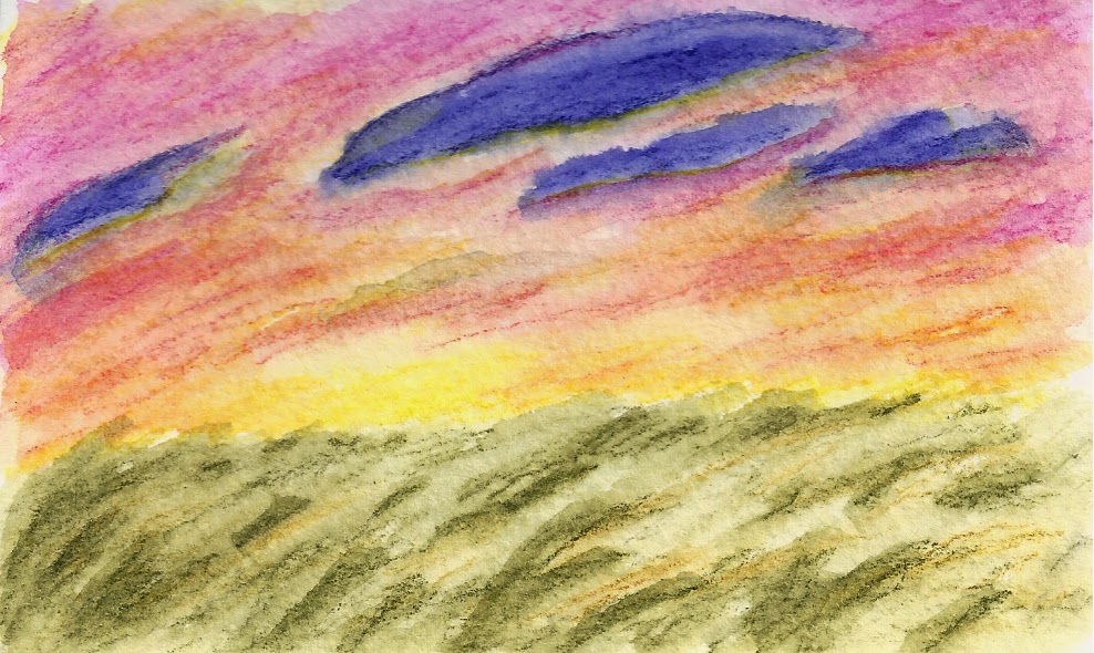
                            Sunset:
  
              Peaceful Valley: 

'Sunset' on 3.5 in x 5 in Strathmore Visual Journal watercolor paper
'Peaceful Valley' on 9x12 in Canson XL watercolor paper

Whether you're a hobbyist, serious, just like messing around, give them a shot.

Monday, April 14, 2014

Experimenting Fun


 Of all the art I created using markers I never really attempted realism. So I push myself to create this lovely test piece. I mainly wanted to improve upon my eye drawing ability to further try to make them realistic. Along the way I decide to experiment with coloring skin. Overall, I am very happy with the result. Coloring with markers is trickier than using colored pencils due to the fact I'm working with ink. Whatever mistakes I do make require more finesse to fix, if possible.

Unfortunately, I wasn't able to take a lot of process shots of this piece. The digital camera has officially crapped out and died. I've taken some pictures on my phone, but I prefer camera quality over iphone. Looks like I have some money to save.


I set down some blue-violet to mark where the darkest shadows are going to be.


Some pictures of the skin being worked on. I mostly went from light to dark without blending first. Once I was pleased about the color placement I then went back to blend everything to help smooth it out.

Title: The Eyes Have It
Medium: Copic markers, white gel pen, Copic opaque white
Paper: 9x12 Strathmore Smooth Bristol


Monday, March 10, 2014

Veiled


I was looking through some photos on my computer and camera, and I realized I had taken process shots of a picture I worked on last year. I had almost forgotten about them. I really do like the pictures I have taken so I though I would share the step by step process I did for this piece. This is by all means no tutorial, but to show what I did to get to the finish product.


After I lightly sketched out the picture I colored over the lines with a dark blue and started defining the shadow areas on her face

I then used the blue to define what will be the darkest parts on her hair.

I began the base color of her skin, using blues and purples for shadows.

Adding more color to her skin. Using pinks, violets, and even a little bit of green too.

Eyes and lips are finished, and I began working on the hair.

Hair is mostly finished.

The veil is done.

I darken the hair more to help give it volume, and darkened some spots on the veil to help make it pop more.

Worked on the background, and smoothed the skin out with a blending stump and it's done!

This picture was fun to do. This was my first piece using purely Faber Castell Polychromos. This is also the first colored pencil drawing I did on Strathmore Smooth Britol. Even though I really like how smooth the skin came out, I was unable to go as dark as I would have like to do to the paper not really having a tooth. It was a fun experiment though.

This piece was done for the Colored Pencil Magazine monthly challenged last year. The monthly challenges are free and open to all! It's a great way for honing your skill, and the people there are super nice. Please check it out. :)

Title: Veiled
Medium: FC Polychromos Colored Pencils
Paper: 9x12 Strathmore Smooth Bristol


Monday, February 24, 2014

Carousel Horse


I've always had a soft spot and a love for carousels. I love how whimsical and elegant the horses look in all their different poses and designs. Unfortunately, it's hard finding a carousel with really gorgeous horses. Most of the time in carnivals, the horses are cookie cutters and twins.

This is just a little tribute for carousels. I wanted to make a white horse with a caramel colored mane. For the design, I took some inspiration with the tack and gear people would have for their horses during the Middle Age(and most likely Renaissance too). Though the design may be simple, I tried to make it elegant.

Here are some progress shots I took. I wanted to take a couple more throughout the process, but the camera was crapping out on me. One day I'll save enough money to buy a better and lighter weight digital camera for myself.


Medium: Colored Pencils
Paper: Strathmore Artagain Black 6x9

Monday, January 27, 2014

Rapunzel


So this weekend I was working on my Rapunzel picture. I must say I am really proud of this one. The layout may be simple, but I love the way I colored her. I really am improving my marker skills. Originally I was planning on printing out the picture of the sun and trace it, but I decided against it for I felt it wouldn't look as natural. I never drew the Tangled sun symbol before, and I think it turned out nice. She is also inked in purple pen.

Just like my Elsa picture, I'll give a list of colors I used.

Skin: E51, E00, E21, BV31
Bodice: V01, BV00, BV11
Skirt: V05, V15, V17
Ties and lace: RV11, RV93, RV95, RV42
Sleeves: R00, RV11, RV34
Hair: Y15, Y19, YR23
Eyes: G43, YG63, C9
Pascal: YG45
Background: Y08, V09, V17, RV91

Title: Rapunzel
Paper: 9x12 Strathmore Smooth Bristol
Medium: Copic markers

And just to compare, here are a couple pictures I did of Rapunzel a couple years ago.


Wednesday, January 22, 2014

Queen Elsa


Hello everyone. I hope your 2014 has started off good. Since I created my one picture of Elsa, I wanted to make another picture of Elsa in her coronation dress (which is my favorite dress that she's in). I just love the color the dress has, and I especially love the cape in which the warm colors really enhance the cooler ones on her dress. 

The only part that was a bit challenging was her hair. Elsa is a platinum blonde, and wanted to make sure her hair wasn't very yellow. So I added some bits of gray in there to help tone it down.

List of Colors:
-Hair: Y000, Y11, Y32, W2 Prismacolor French gray
-Dress: T4, T5, T8- BG72, BG75, BG78-YR23, YR15, Y19, Y28
-Cape: RV19, V06, RV66- V95
-Skin: E50, E000, E51
-Glove: BG13, BG15

Title: Queen Elsa
Paper: 9x12 Strathmore Smooth Bristol
Medium: Copic markers with a little colored pencil for minor details, and white gel pen

Up Next: Rapunzel!